
March of the Penguins
In this post, I will be constructing a basic data visualization in Python using the Palmers Penguins dataset.
§1. Required Packages
To follow this tutorial, the following packages are required.
import numpy as np
import pandas as pd
from matplotlib import pyplot as plt
import seaborn as sns
§2. Downloading Data
To start, we need to download and read the Palmer Penguins dataset.
url = "https://raw.githubusercontent.com/PhilChodrow/PIC16B/master/datasets/palmer_penguins.csv"
penguins = pd.read_csv(url)
Let’s examine what the data looks like.
penguins.head()
| studyName | Sample Number | Species | Region | Island | Stage | Individual ID | Clutch Completion | Date Egg | Culmen Length (mm) | Culmen Depth (mm) | Flipper Length (mm) | Body Mass (g) | Sex | Delta 15 N (o/oo) | Delta 13 C (o/oo) | Comments | |
|---|---|---|---|---|---|---|---|---|---|---|---|---|---|---|---|---|---|
| 0 | PAL0708 | 1 | Adelie Penguin (Pygoscelis adeliae) | Anvers | Torgersen | Adult, 1 Egg Stage | N1A1 | Yes | 11/11/07 | 39.1 | 18.7 | 181.0 | 3750.0 | MALE | NaN | NaN | Not enough blood for isotopes. |
| 1 | PAL0708 | 2 | Adelie Penguin (Pygoscelis adeliae) | Anvers | Torgersen | Adult, 1 Egg Stage | N1A2 | Yes | 11/11/07 | 39.5 | 17.4 | 186.0 | 3800.0 | FEMALE | 8.94956 | -24.69454 | NaN |
| 2 | PAL0708 | 3 | Adelie Penguin (Pygoscelis adeliae) | Anvers | Torgersen | Adult, 1 Egg Stage | N2A1 | Yes | 11/16/07 | 40.3 | 18.0 | 195.0 | 3250.0 | FEMALE | 8.36821 | -25.33302 | NaN |
| 3 | PAL0708 | 4 | Adelie Penguin (Pygoscelis adeliae) | Anvers | Torgersen | Adult, 1 Egg Stage | N2A2 | Yes | 11/16/07 | NaN | NaN | NaN | NaN | NaN | NaN | NaN | Adult not sampled. |
| 4 | PAL0708 | 5 | Adelie Penguin (Pygoscelis adeliae) | Anvers | Torgersen | Adult, 1 Egg Stage | N3A1 | Yes | 11/16/07 | 36.7 | 19.3 | 193.0 | 3450.0 | FEMALE | 8.76651 | -25.32426 | NaN |
The columns of interest for this tutorial are the following:
- Species
- Culmen Length (mm)
- Culmen Depth (mm)
§3. Manipulating Data
We are interested in the relationship between culmen length and culmen depth by species. However, the species names are pretty long. To solve this, we can shorten the species’ names.
# Split the species' names into lists and only save the first element of each.
penguins['Species'] = penguins['Species'].str.split().apply(lambda x: x[0])
§4. Plotting Data
We can use the Seaborn package to easily create a scatterplot. Note that we use the species for the hue argument to visually distinguish between each species.
# Use the alpha argument to view points that are stacked.
sns.scatterplot(x = 'Culmen Length (mm)', y = 'Culmen Depth (mm)', data = penguins,
                hue = 'Species', s = 50, linewidth = 0, alpha = 0.7)
plt.title('Culmen Length vs. Depth by Species')
plt.show()
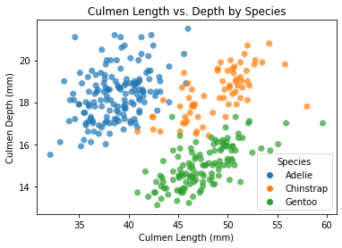
What can we infer from this plot?
Based on this scatter plot, there appears to be a positive correlation between culmen depth and culmen length for each species of penguins.